Promotional video edit for a luxury belt brand, adapted for Instagram Reels. I converted shaky 16:9 footage into a stabilized 9:16 format, using zoom and reframing techniques to keep the belt buckle centered and visually prominent while maintaining a smooth, high-end feel.

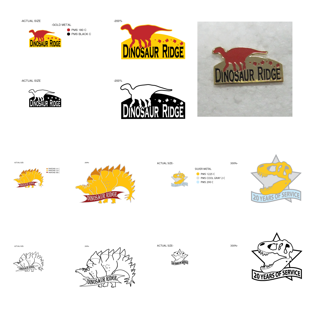
During my in-house design role at Best in West (later Joycrest), a screen print and embroidery company, I gained experience designing various promotional items, including enamel pins. A key responsibility was adapting client artwork for production as enamel pins. I developed a systematic vectorization process that accounted for the specific constraints of pin manufacturing, including line weight and color limitations. This often involved skillfully refining challenging source material to create effective enamel pin artwork.
Date: 2003-2019
In-house: Best in West / Joycrest
Role: Designer - Creative Director
Tags: #PinDesign #BrandedMerch #PromotionalProducts #EnamelPins
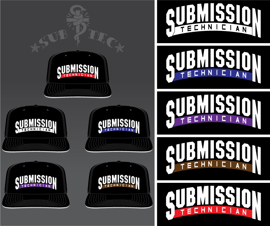
SUB TEC is a conceptual clothing brand I founded, drawing inspiration from my passion for jiu jitsu. This project encompasses a series of embroidered cap and patch designs, with the patches specifically sized for cap application. All cap designs incorporate a deliberate combination of flat and puff embroidery techniques.
Date: 2018
Client: Sub Tec
Role: Designer
Tags: #EmbroideryDesign #HatDesign #LogoDesign #GraphicDesign #BrandedMerch

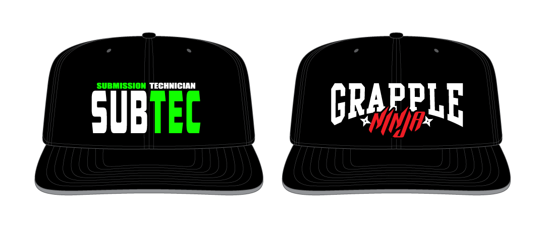
Ranked Caps' design strategically utilizes puff embroidery exclusively for the large lettering, creating a raised effect. Smaller text elements and the colored bar are executed in flat embroidery, positioned lower on the cap for visual hierarchy and a multi-dimensional texture.

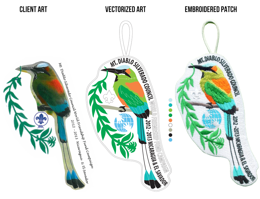
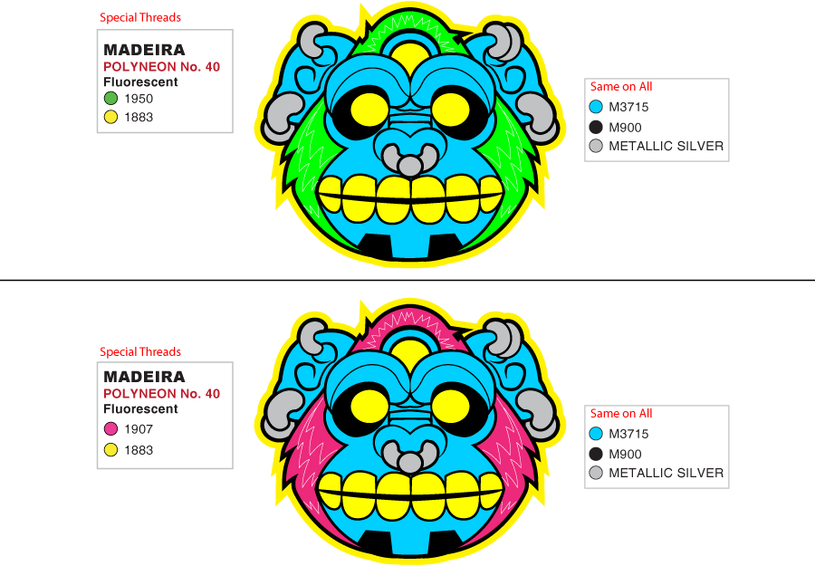
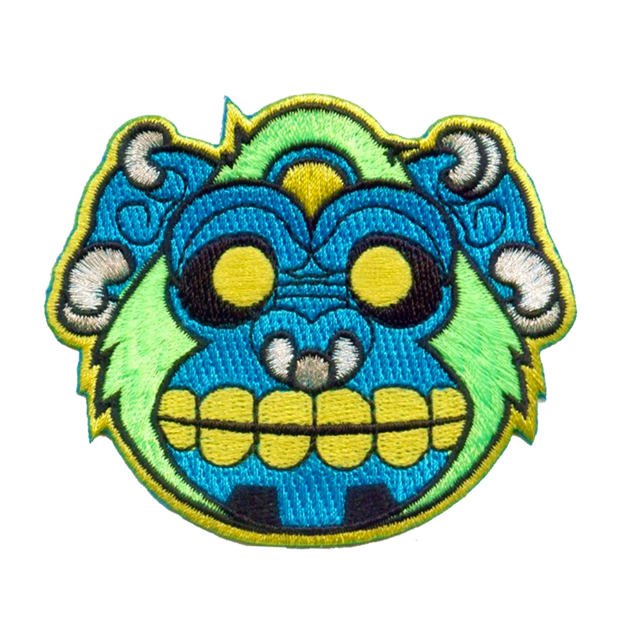
A significant portion of my design career was spent in-house at Best in West (later Joycrest), a screen print and embroidery company. A primary responsibility involved transforming client-provided artwork into viable patch designs. I developed a systematic vectorization process that clearly communicated stitch types to the digitizer. This often required skillfully refining low-resolution images and rough sketches to create high-quality embroidered patches, leading to my expertise in simplifying artwork for embroidery.
Date: 2003-2019
In-house: Best in West / Joycrest
Role: Designer - Creative Director
Tags: #EmbroideryDesign #PatchDesign #SimplifiedArt #EmbroideryArt #PromotionalProducts







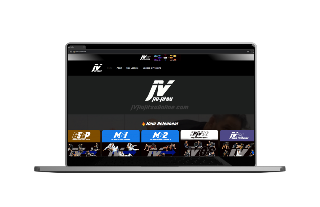
This project involved creating a dynamic online platform for Javier Vazquez of JV Jiu Jitsu, a distinguished MMA fighter and Jiu Jitsu black belt. Recognizing his need to showcase a new system and provide access to online courses, the strategic approach was to develop a simple, effective, and highly efficient website with an intuitive, mobile-first design, mirroring the seamless feel of a dedicated application.
Date: 2023
Client: JV Jiu Jitsu
Role: Designer / Developer
Tags: #WebDesign #WebDevelopment #GraphicDesign #VideoEditing #IGReelCreation #UIDesign #UXDesign #NoCode

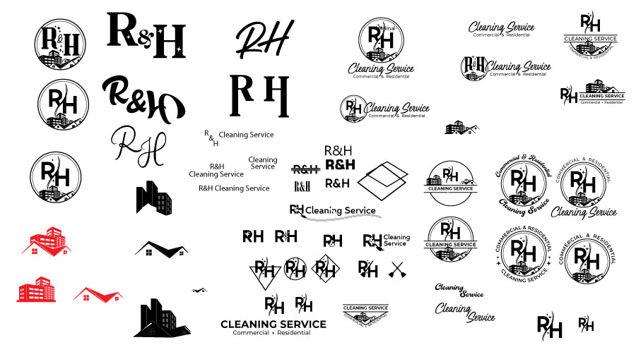
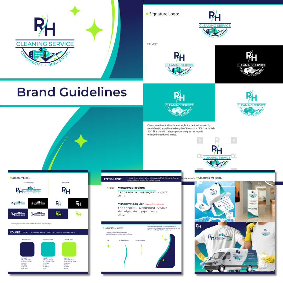
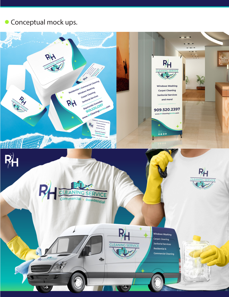
RH Cleaning Service was ready to elevate their brand and needed a professional logo and cohesive branding to match their growth. To support their vision, I created a tailored "Launch Package" to jumpstart their business. This package included a custom logo design with a basic brand guide, a streamlined website, and comprehensive online optimization.
Date: Sept. 2024
Client: RH Cleaning Service
Role: Graphic/Web Designer, SEO Optimizer
Tags: #LogoDesign #GraphicDesign #WebDesign #SEO #OnlineOptimization
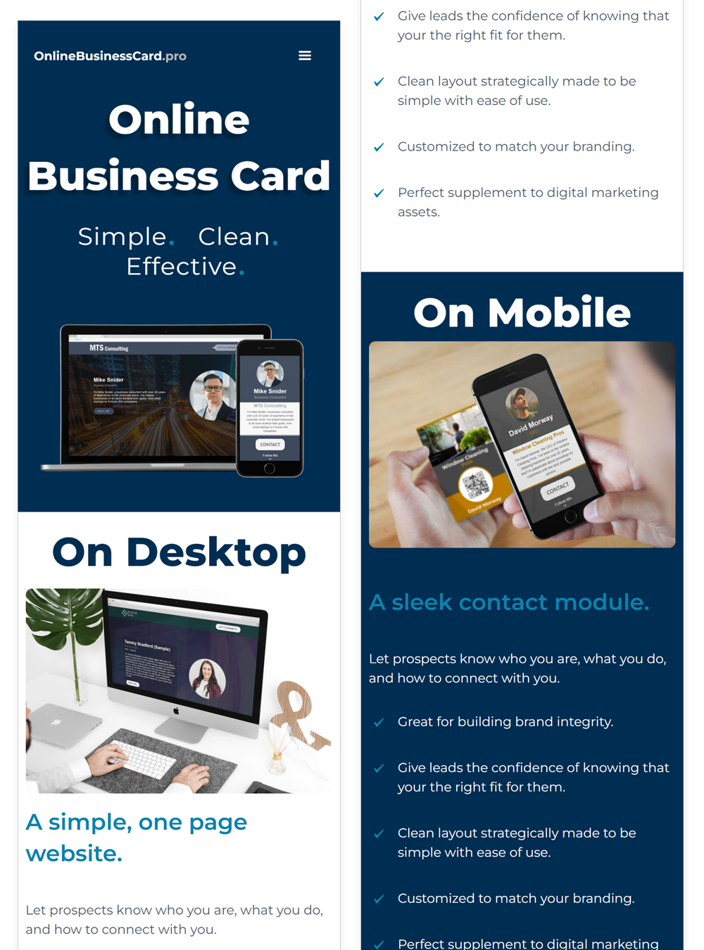
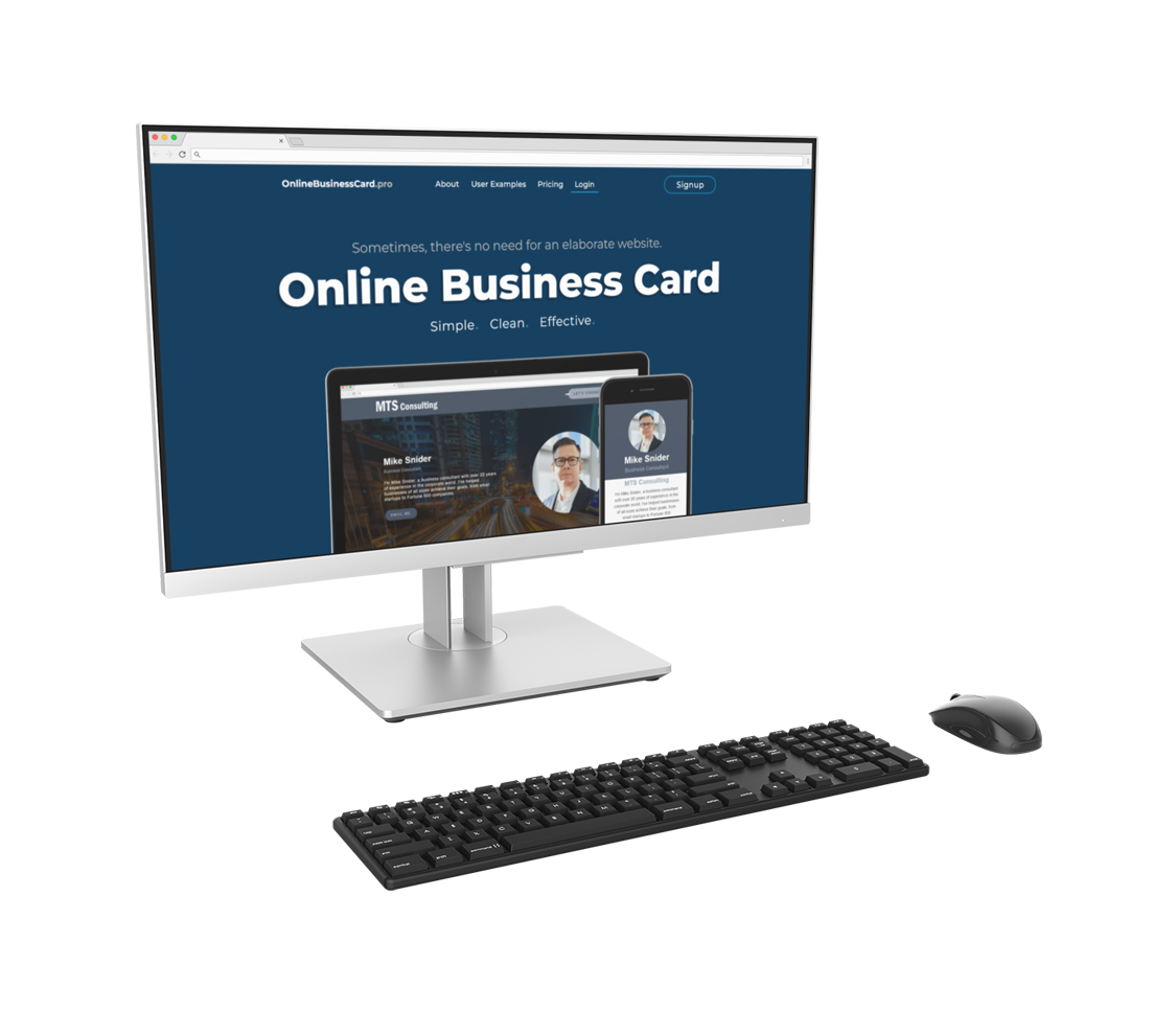
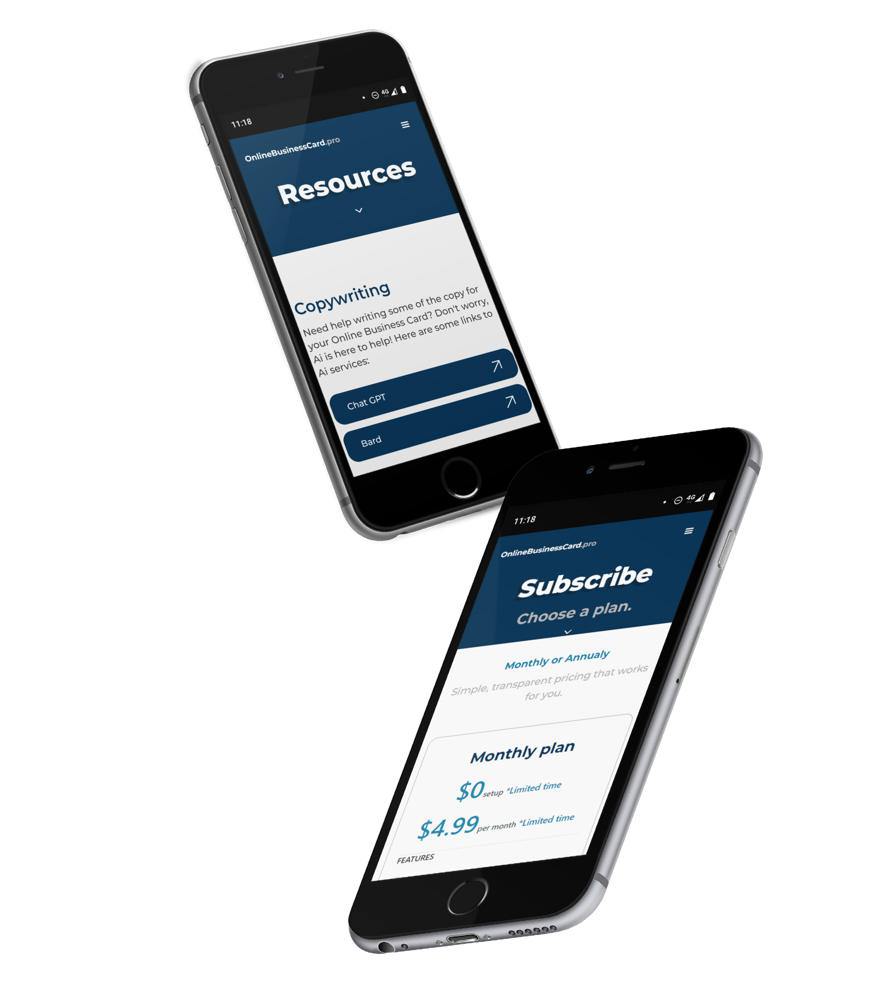
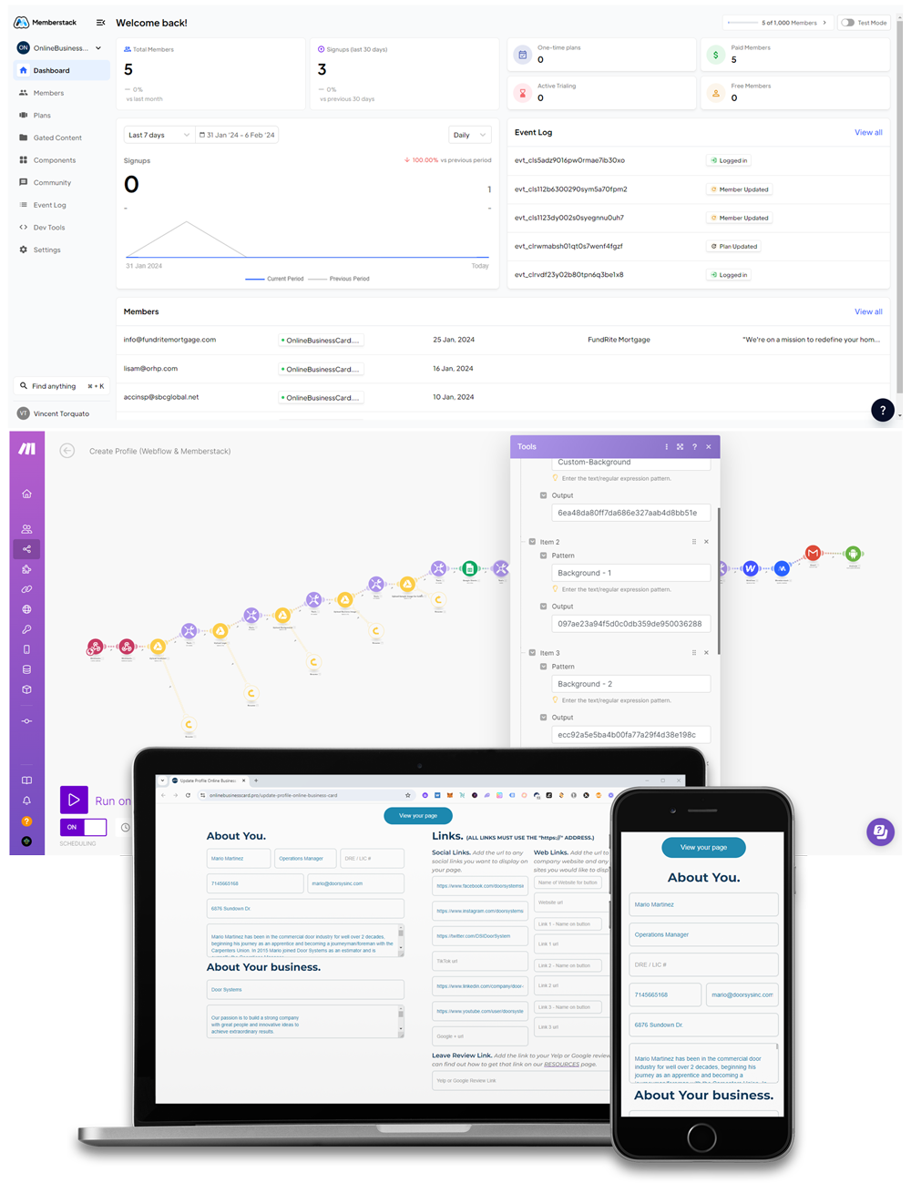
Let prospects know who you are, what you do, and how to connect with you. A simple 1 page website and contact modal for networking. Still in beta. I developed everything from idea to execution.
Date: 2023 -Present
Client: OnlineBusinessCard.pro
Role: Designer / Developer
Tags: #ProductDesign #UIDesign #UXDesign #WebApp #WebDesign #Automation #Branding #Developement #NoCode
Logo Design and Illustration
Date: Dec 2022/ Jan 2023
Client: 121G
Role: Designer
Tags: #Branding, #GraphicDesign, #Illustration, #Webdesign


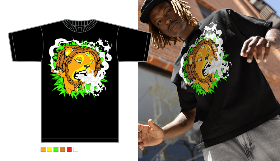
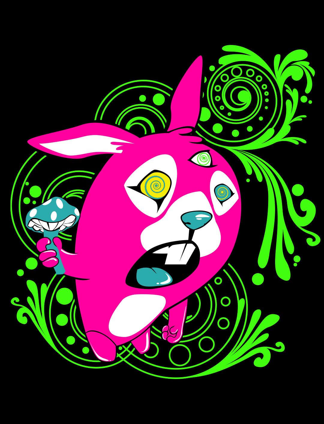
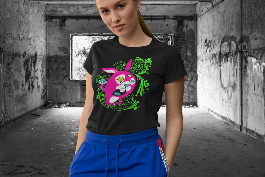
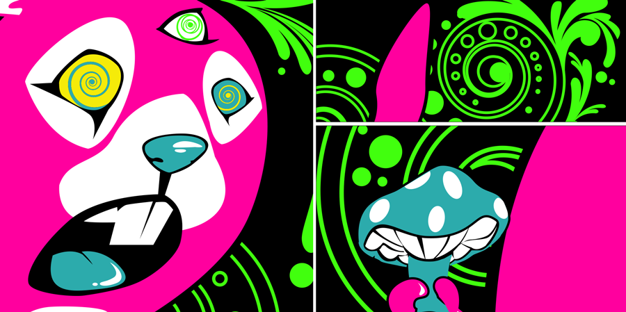
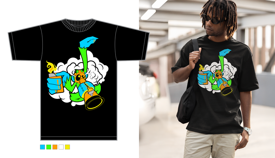
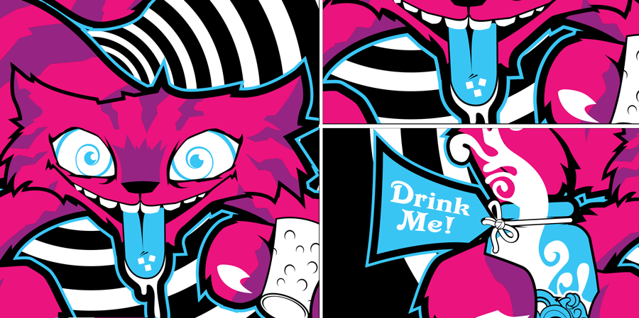
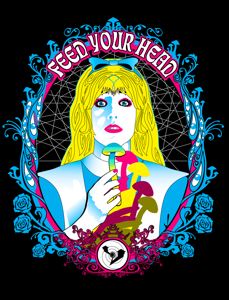
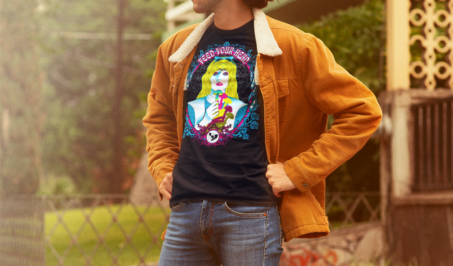
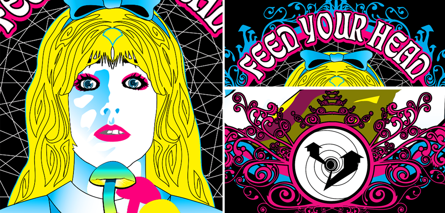
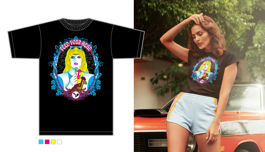
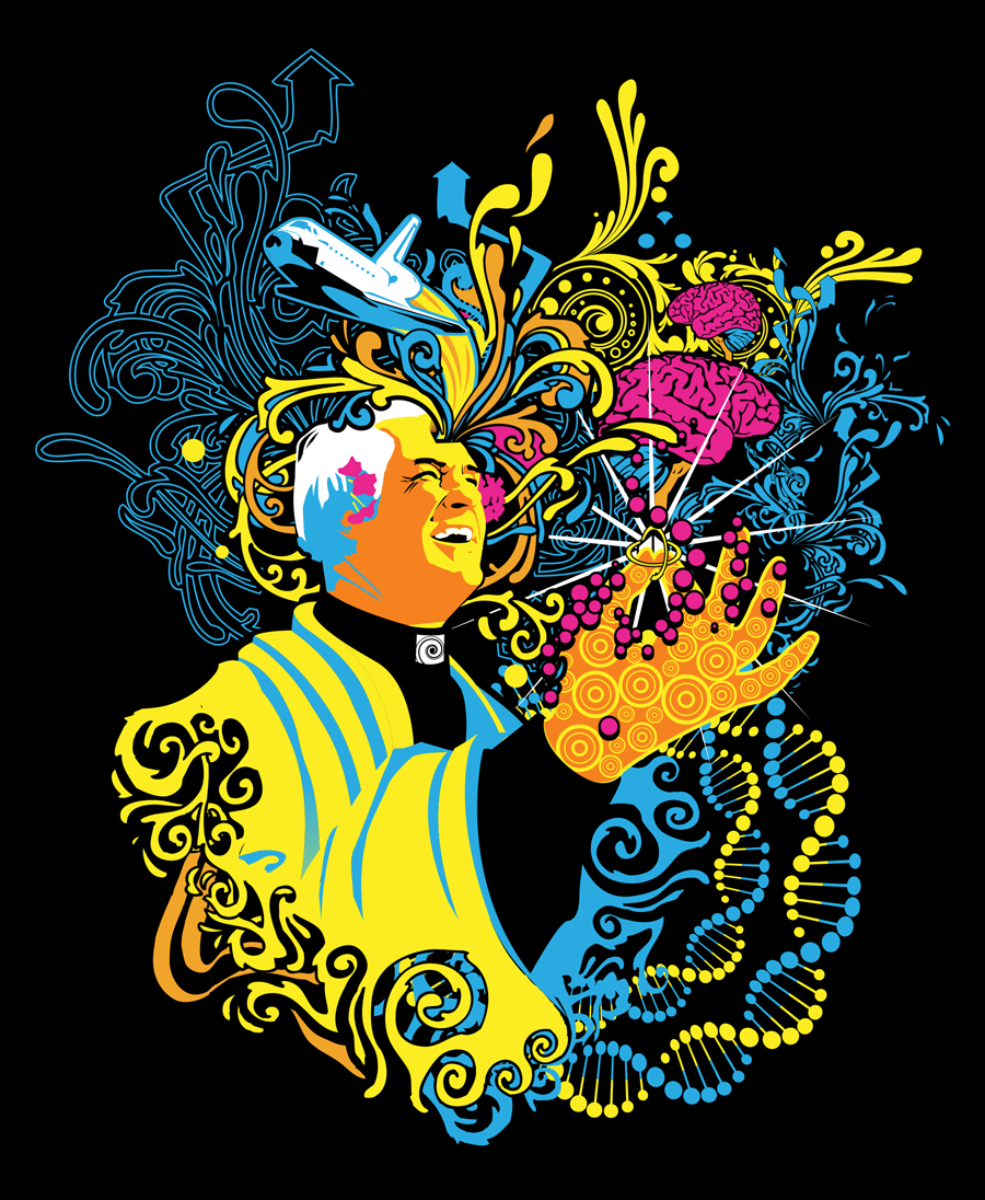
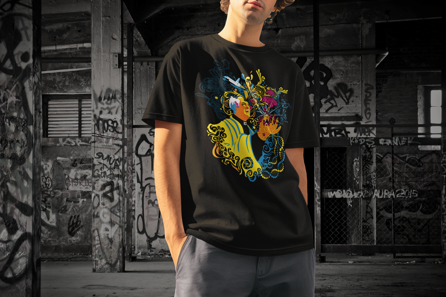
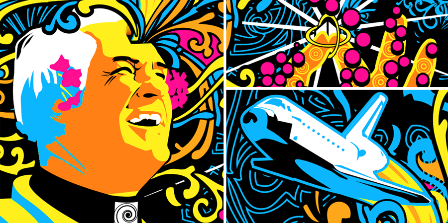
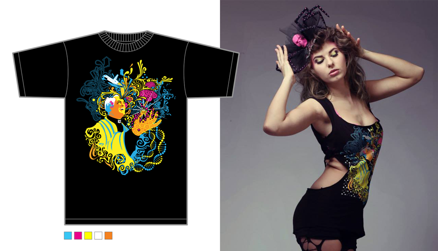
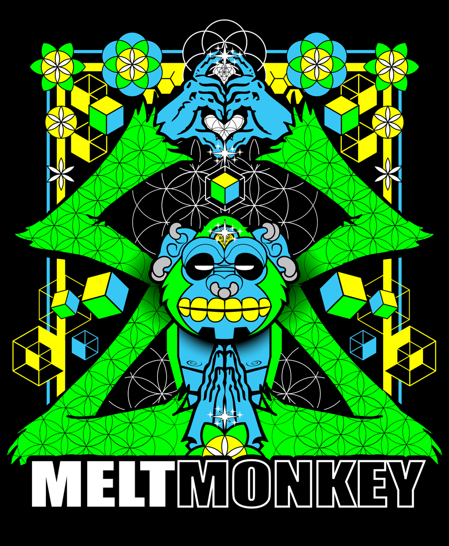
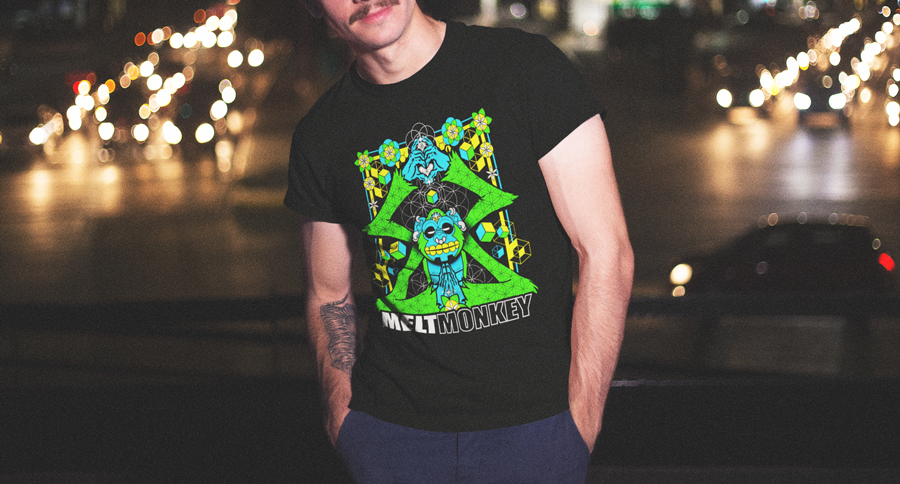
Date: Mar 2006/ Jun 2014
Client: N/A Personal Project
Role: Creator
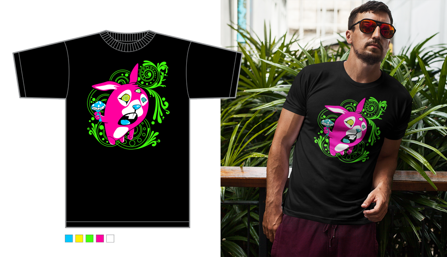
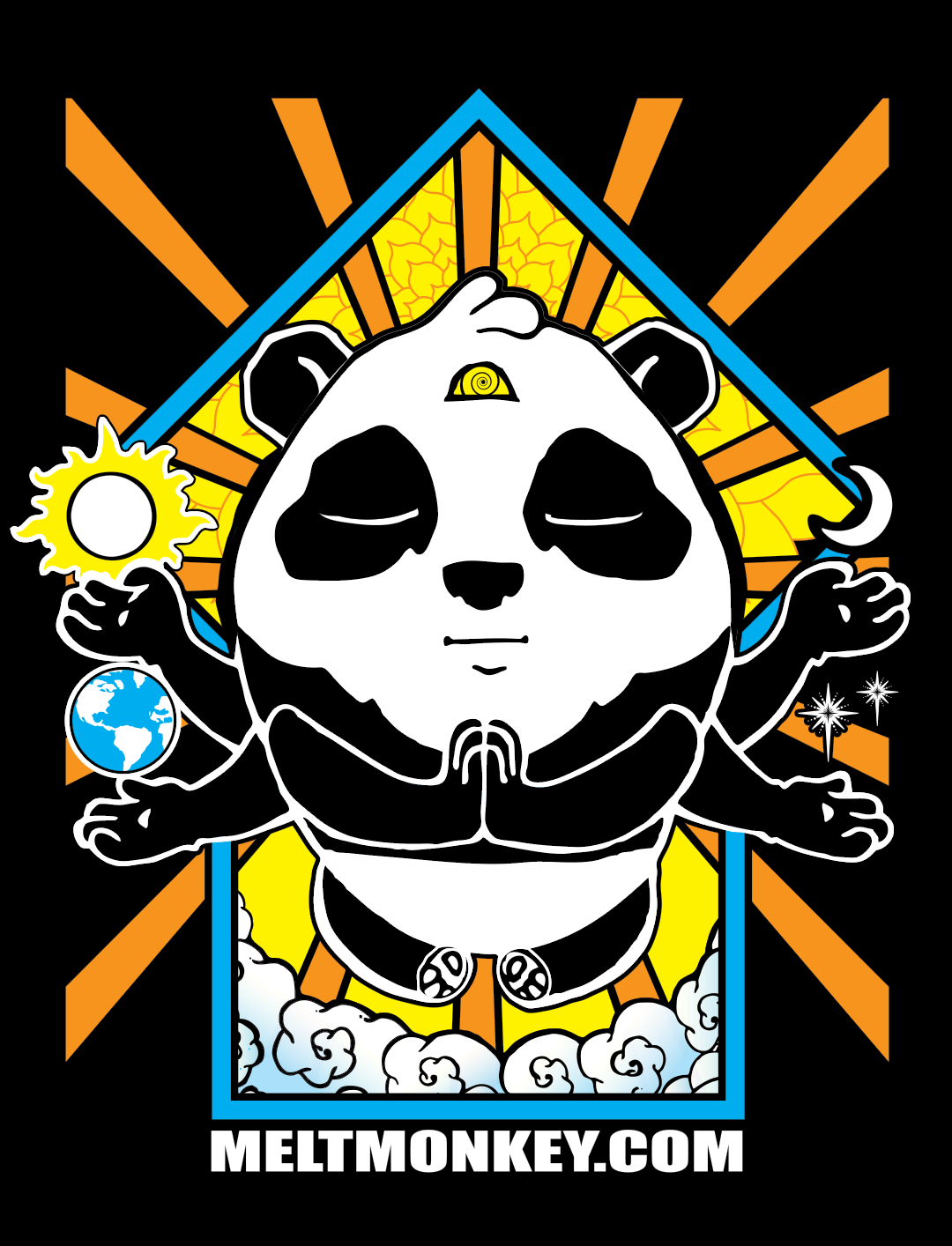
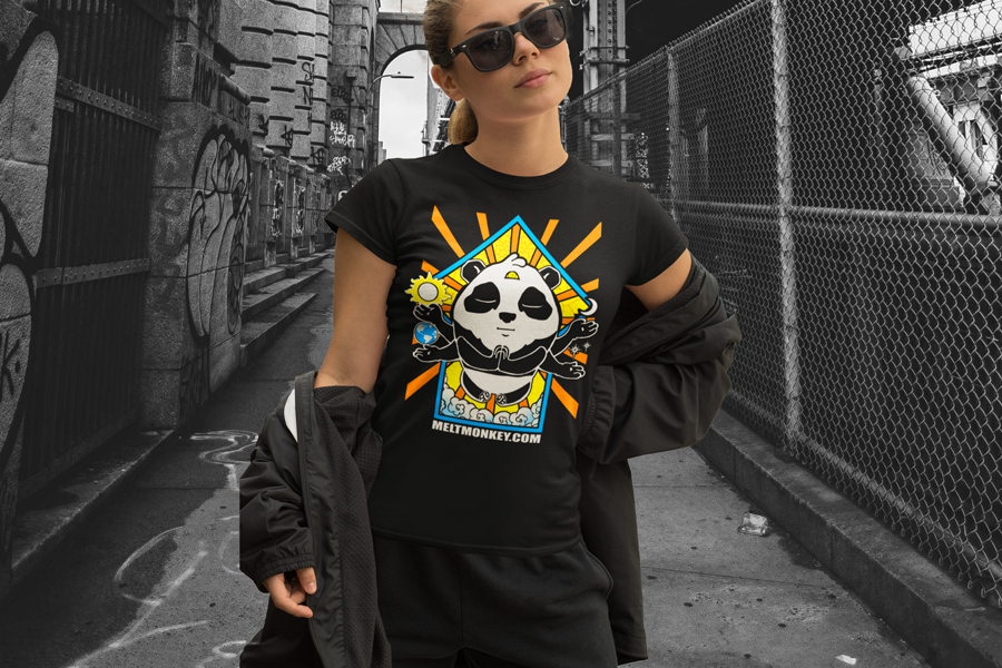
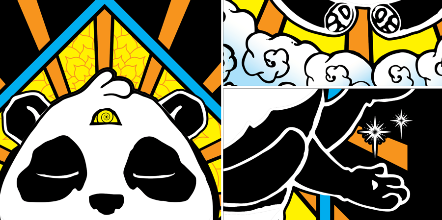
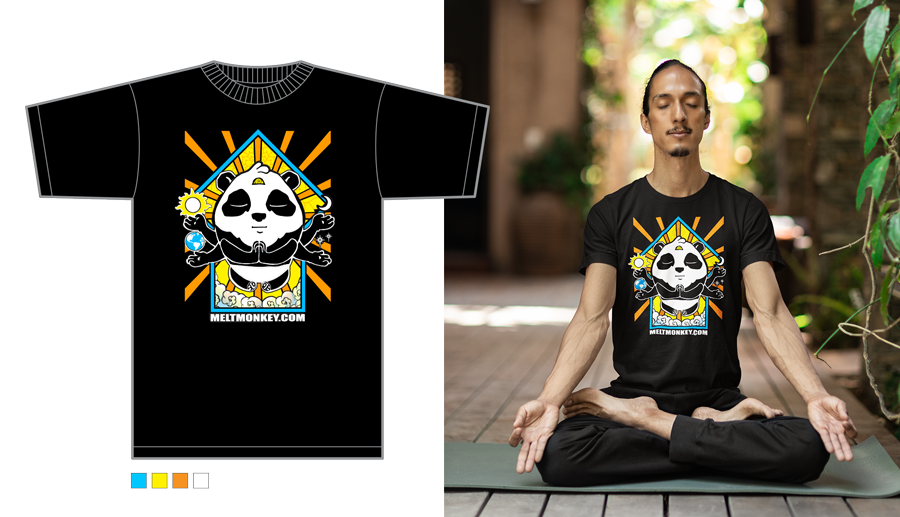
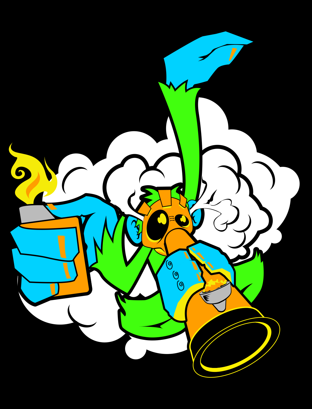
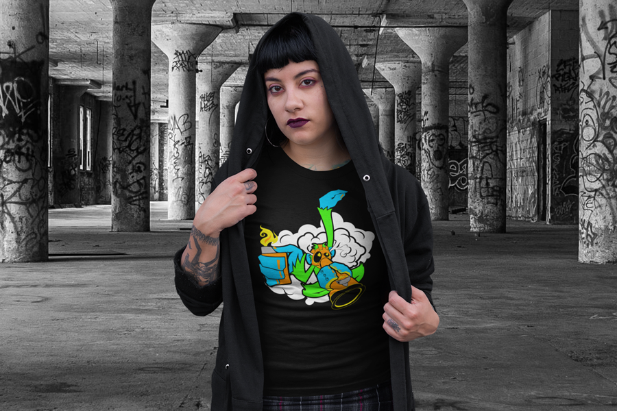
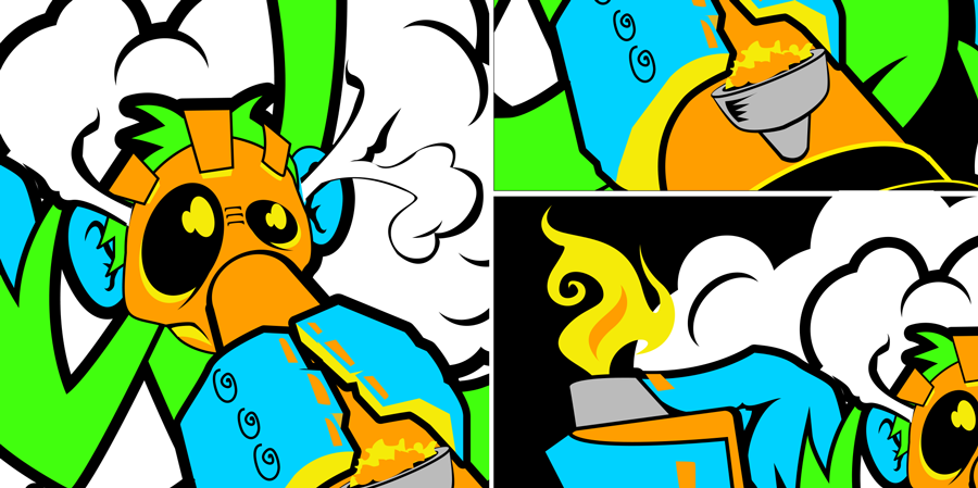
Tags: #GraphicDesign #ApparelDesign #Illustration #Marketing #Strategy #ClothingLine
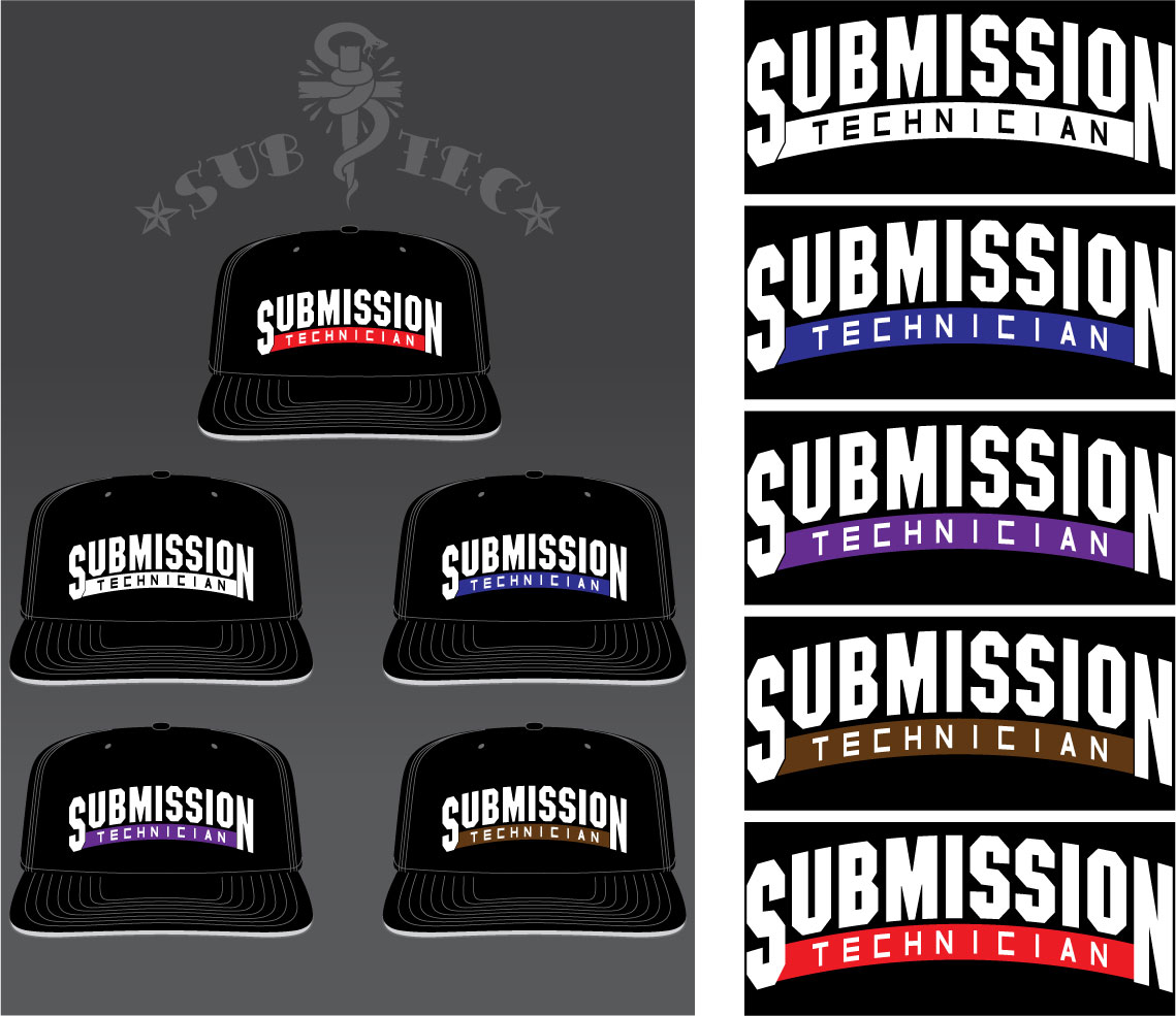
Ranked Caps' design strategically utilizes puff embroidery exclusively for the large lettering, creating a raised effect. Smaller text elements and the colored bar are executed in flat embroidery, positioned lower on the cap for visual hierarchy and a multi-dimensional texture.
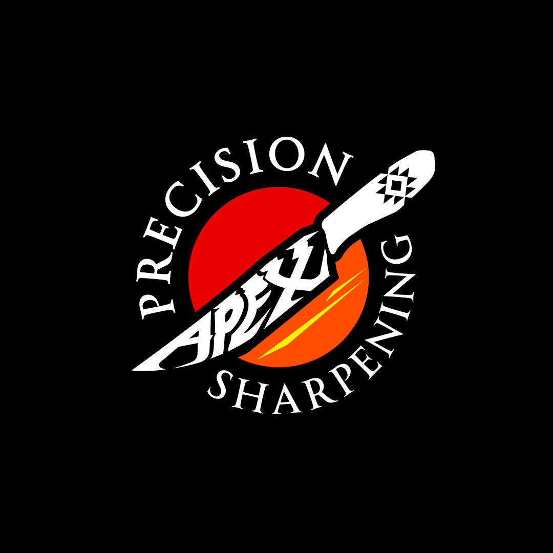
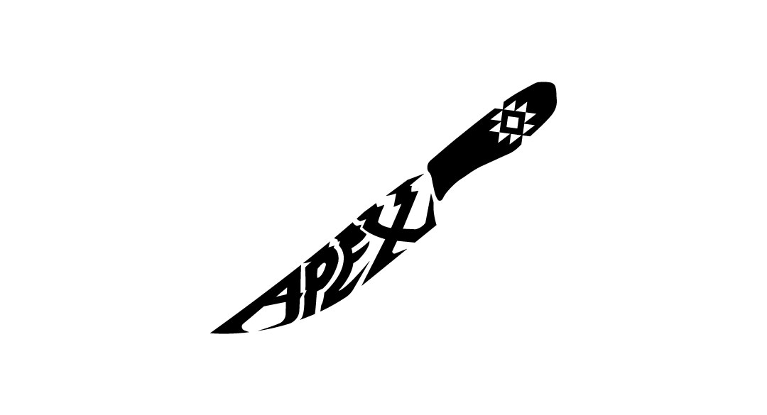
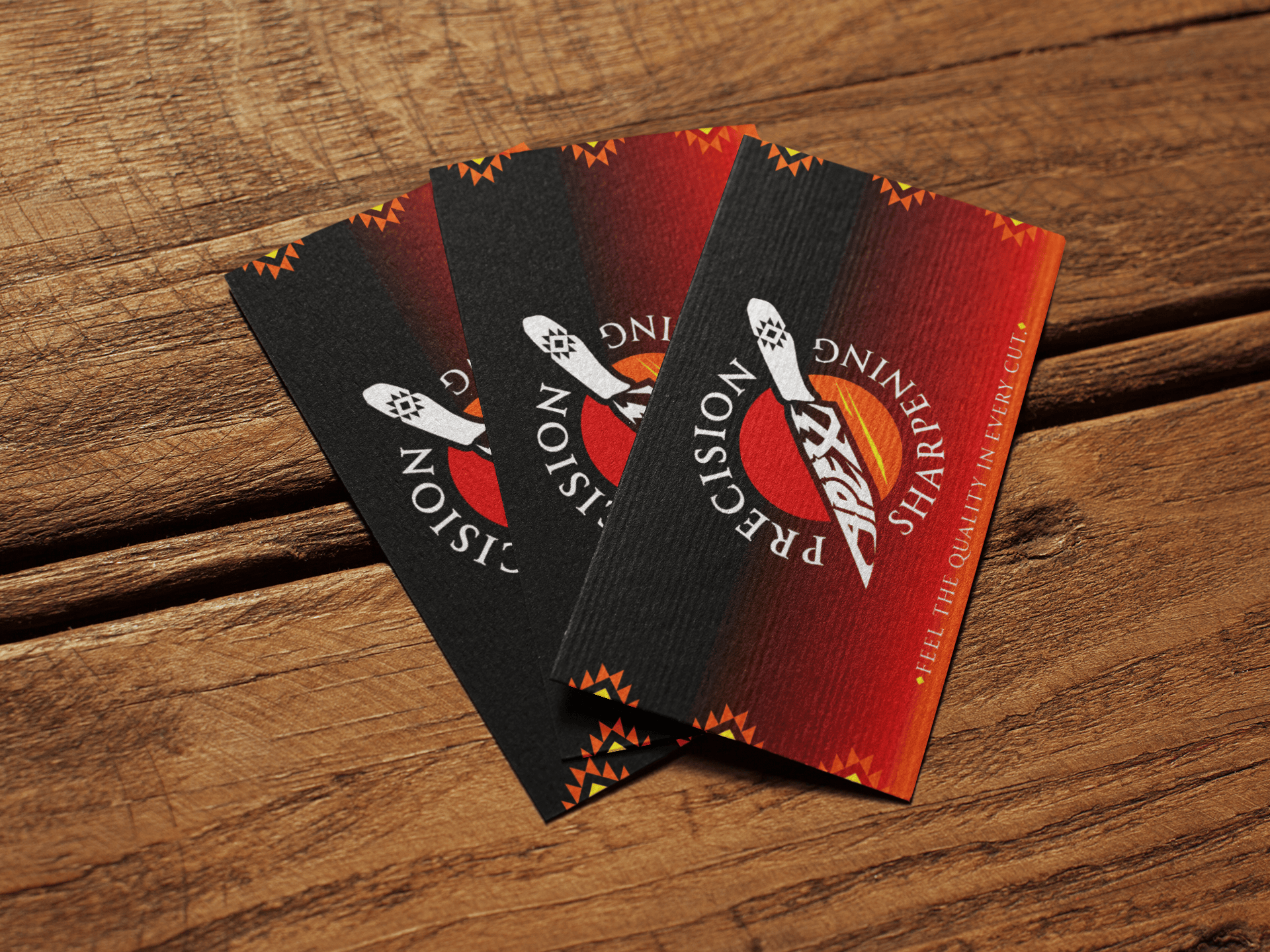
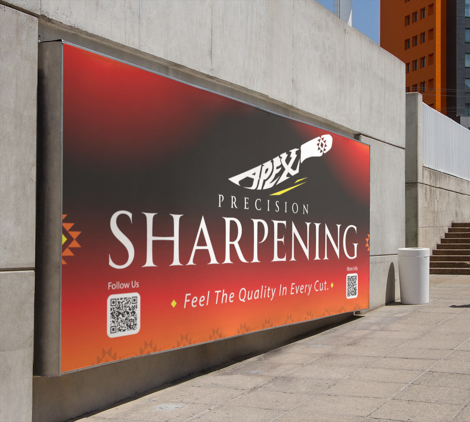
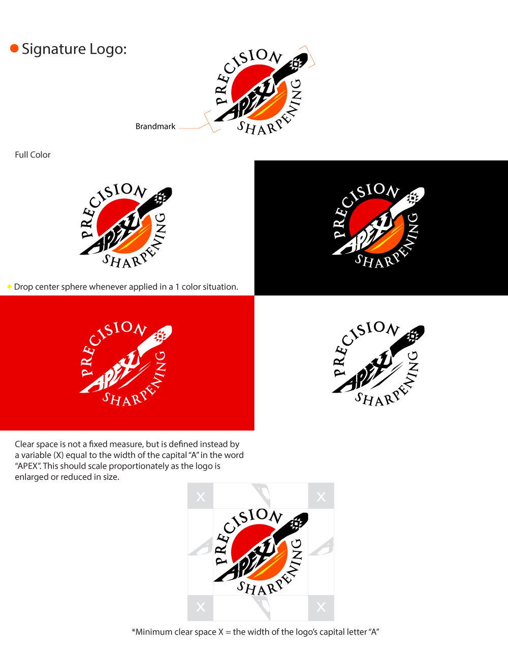
Apex Precision Sharpening in La Verne sought a logo that reflected their Mexican heritage. The design concept incorporated a hand-drawn knife shape, accented with a subtle Aztec triangle pattern. This unique combination aimed to create a visually appealing and culturally relevant logo that would resonate with their target audience.
Date: May 2024
Client: Apex Precision Sharpening
Role: Designer
Tags: #LogoDesign #Branding, #GraphicDesign, #Illustration
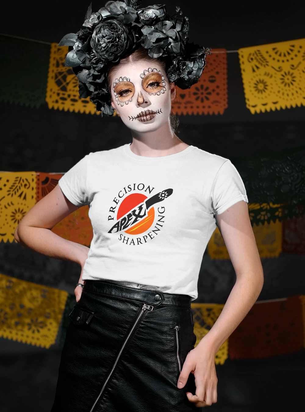
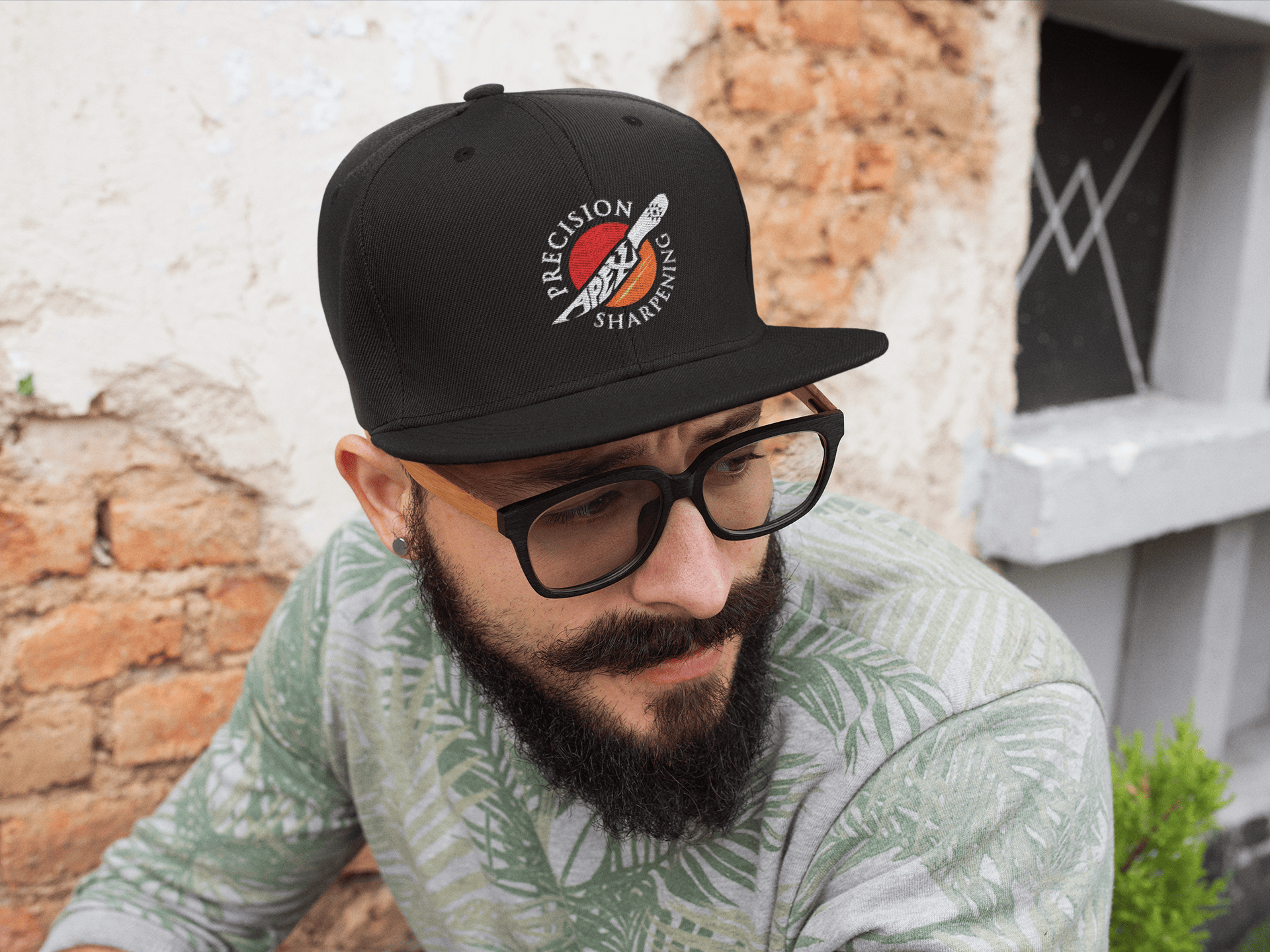
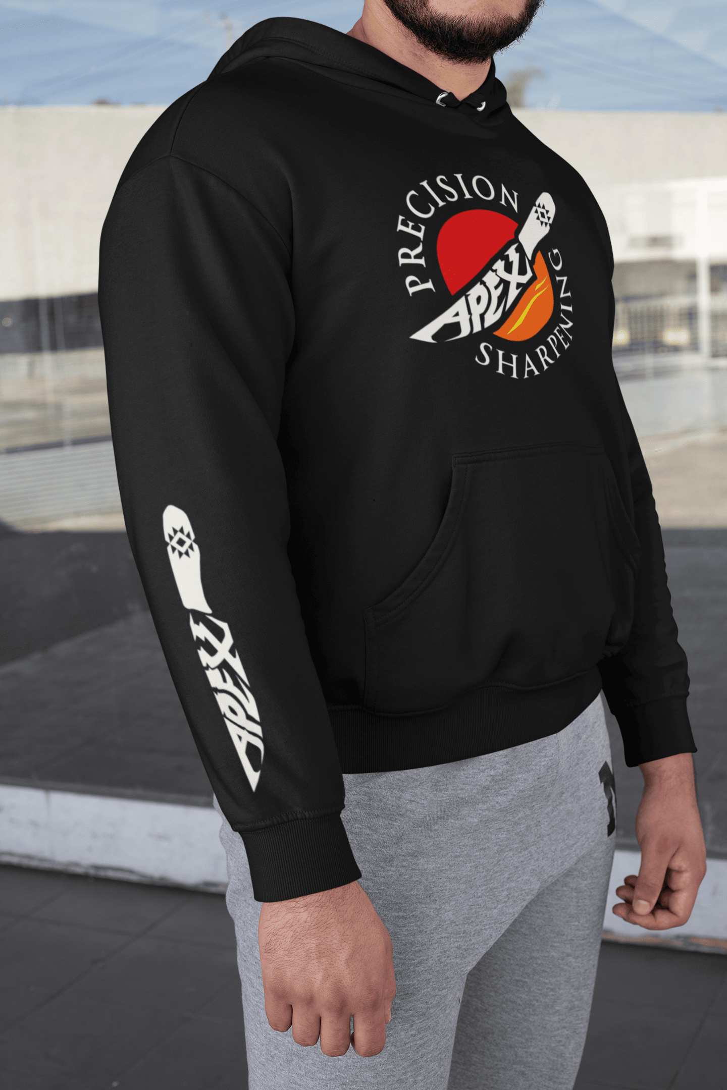
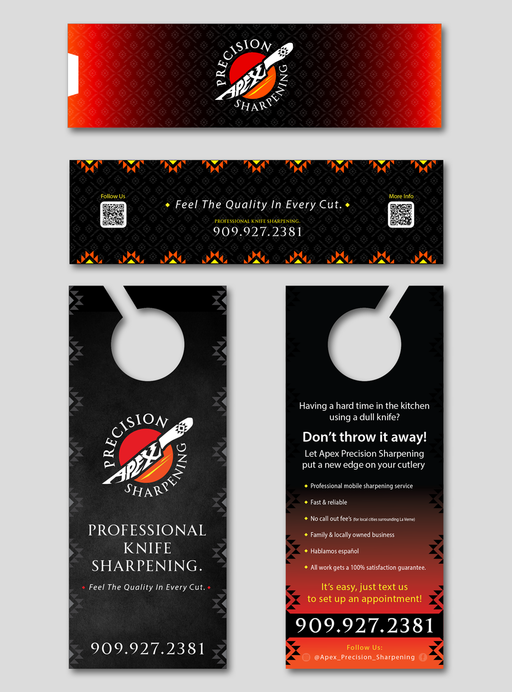

"It’s was great working with Vinny! If I could describe him in a few words i would use humble, imagineer, business minded, but overall a genius! I needed a logo for my sharpening business. I reached out to Vinny, he took all my ideas for the logo and brought it to life. Vinny also made business cards and door hangers for my business. The website is next project I’ll have Vinny work on for us. He’s such an asset to any business that puts him on their team!"
-Alberto Rodriguez - Apex Precision Sharpening
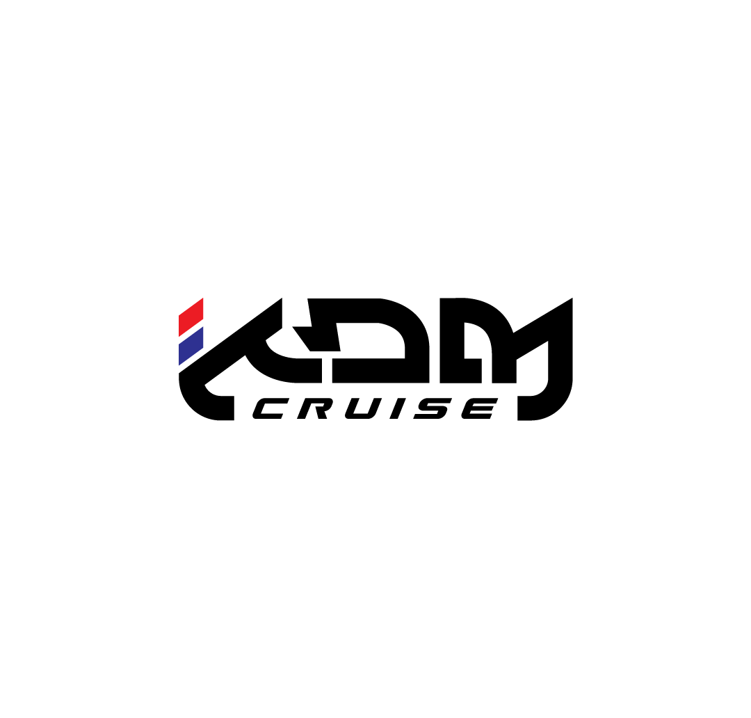
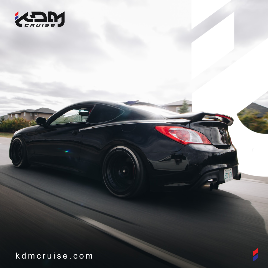
KDM Cruise was created out of the love for Korean made cars. KDM stands for "Korean Domestic Market". My client was organizing a cruise meet for KDM car enthusiasts and was seeking to brand the event with a logo. Bringing together a community is no simple task, so the mission for this project was to deliver a logo that has a sense of legitimacy within the community and is visually appealing in a way that the individuals that attend the KDM Cruise will be proud to support the brand.
Date: July 2021
Client: KDM Cruise
Role: Designer
Tags: #LogoDesign #Branding, #GraphicDesign
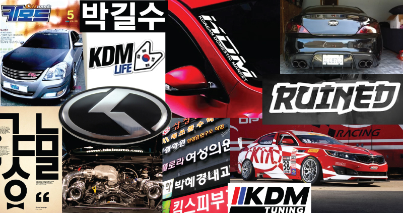
While diving into discovery, I found a lot of cool stuff! Creating a unique mark that presents a professional, modern, established look and feel was the challenge.
Discovery boards are a great way to narrow down the style direction and have a visual reference of do's and don'ts.
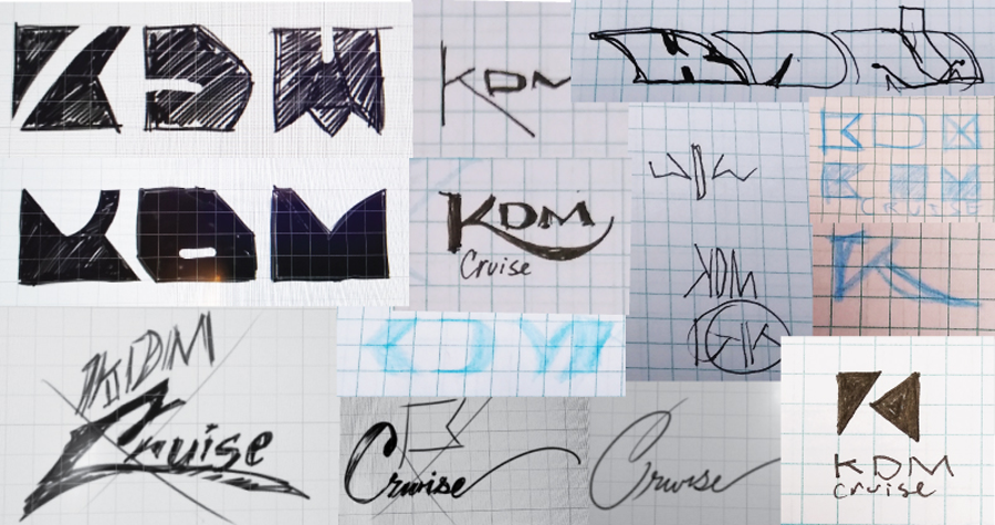
As inspirations arise, I jot them down in sketch form. This practice helps to weed-out bad ideas.
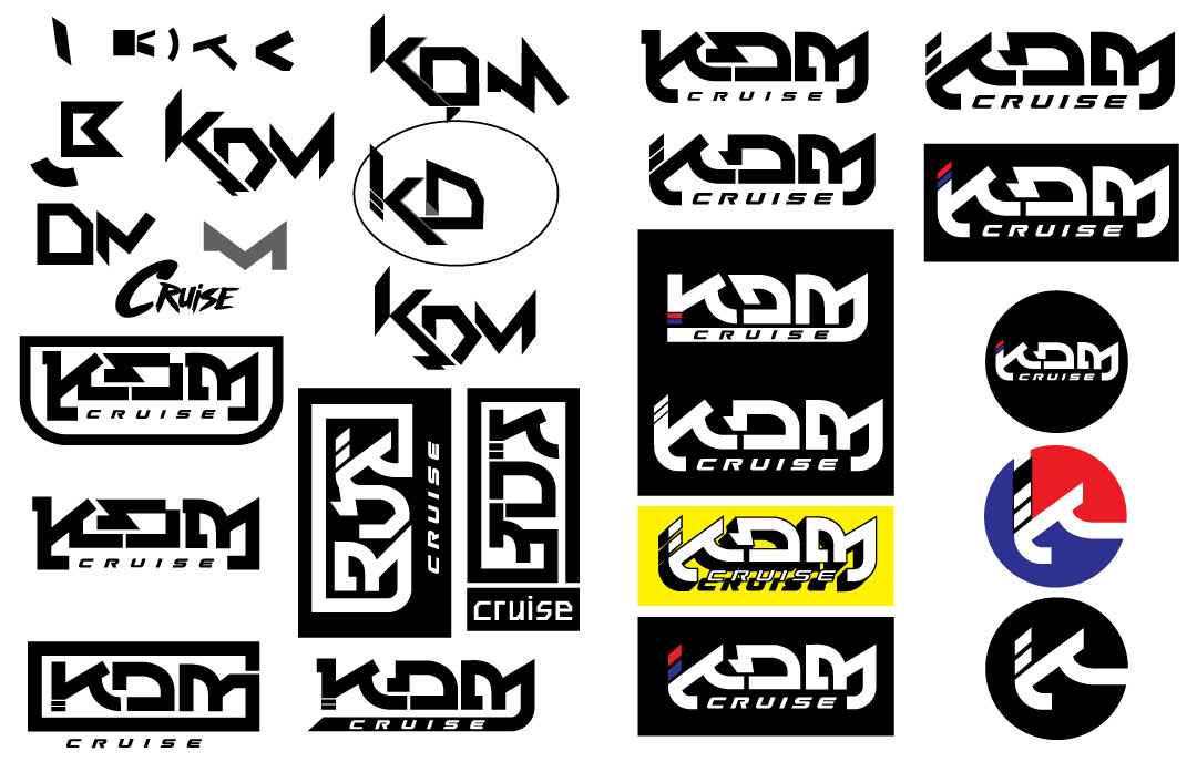
After purging out some raw sketches and establishing a clear direction, I go straight to Adobe Illustrator. Sketching ideas with the pen tool allows me to utilize precise straight lines and shapes.
"We are extremely pleased with Meltmonkey Design Studio and Vincent's ability to take our brand identity to the next level. He conducted in depth industry research and took the time to understand our vision and goals. We were included in the logo design process along the way. The end result packaged graphic elements for our business that have provided us with the tools to succeed and inspired us to envision the possibilities of further impact."
-Liz Burgon, Lead Event Organizer


Ridgetop Insurance Services is located in Rancho Cucamonga, CA. They were in need of a logo and wanted something to represent what their company stands for. Protecting families and individuals.
Date: May 2021
Client: Ridgetop Insurance Services
Role: Designer
Tags: #LogoDesign #Branding, #GraphicDesign, #IdentityDesign
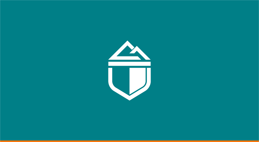
Ridgetop is very passionate about providing professional and affordable insurance services to their local area of Rancho Cucamonga, CA. It was important to implement something that could represent the city for their brand.
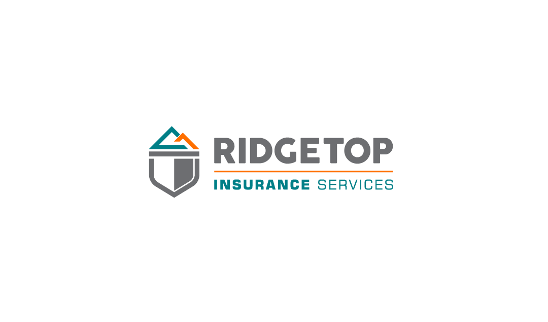
Providing protection from future, unforeseen events is what Ridgetop is here to do. With the primary cliental that they service coming to them for life and home insurance, an emphasis on family and homeowners was needed. Some of the key takeaways for the aesthetics of the design were to be bold, app like, modern, clean, and unique.
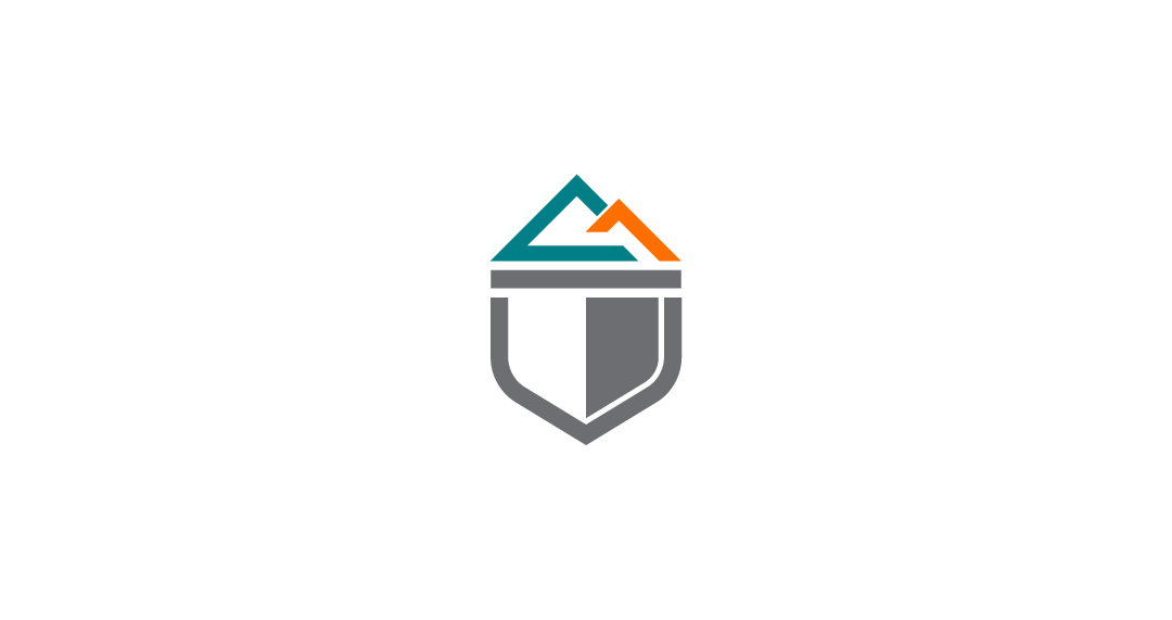

A couple of challenges for this design were to capture the core values of the company and to make the mark unique from anything you find when searching "ridgetop logo / icon".
I like to hit the drawing board in a free-flowing way to purge out bad ideas.
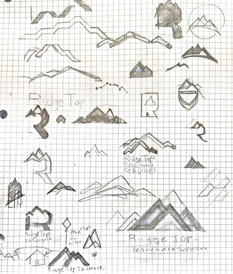
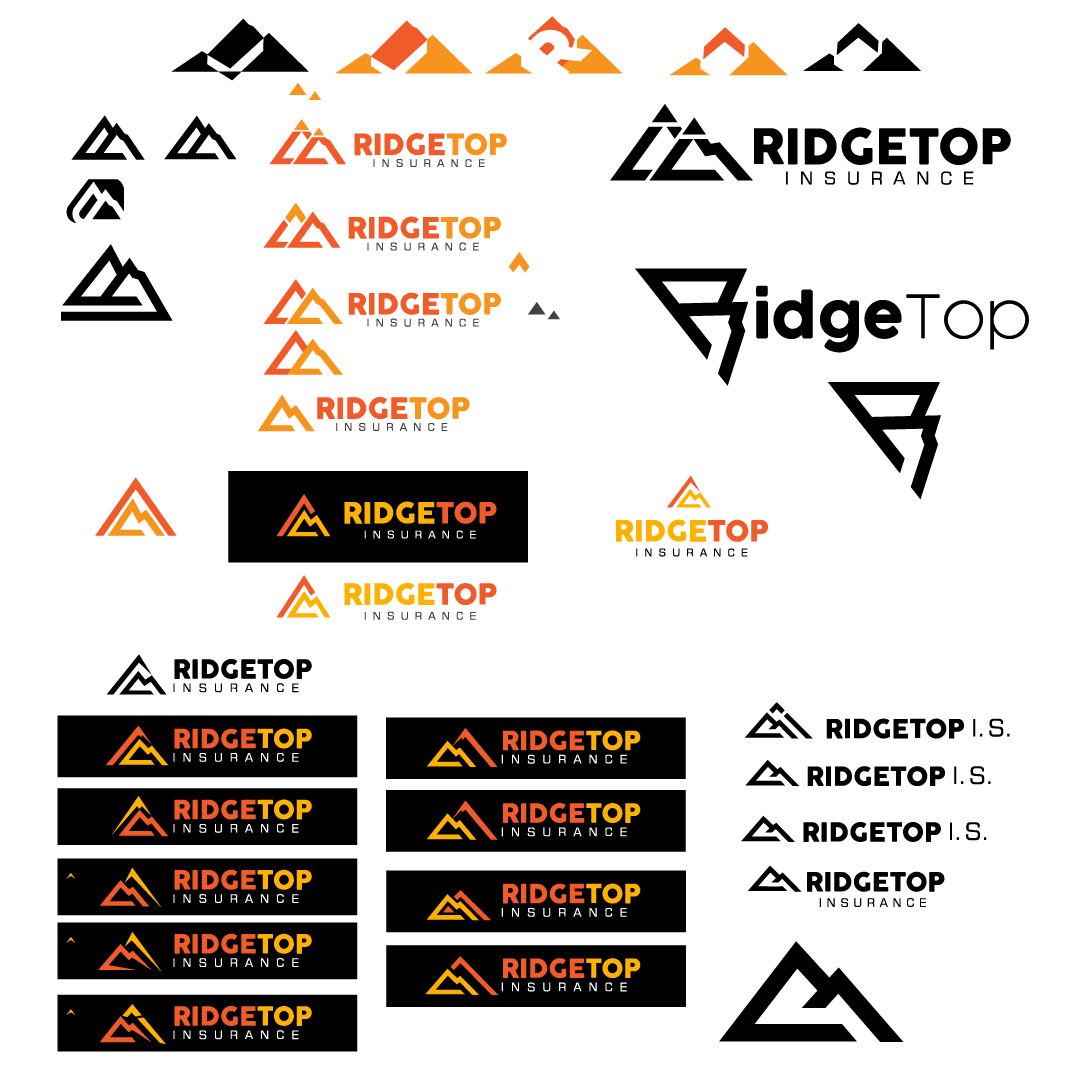
After sketching out ideas, I go straight to Adobe Illustrator. With insight from the pencil sketches, I begin the process again, but with the clean and solid structure that vector provides.(The pen tool rocks!)
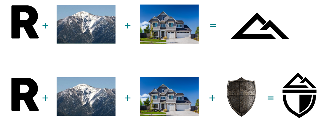
Formula: The letter "R" + the ridgetop of Cucamonga Peak + a house to represent family/homeowner and a shield for protection.
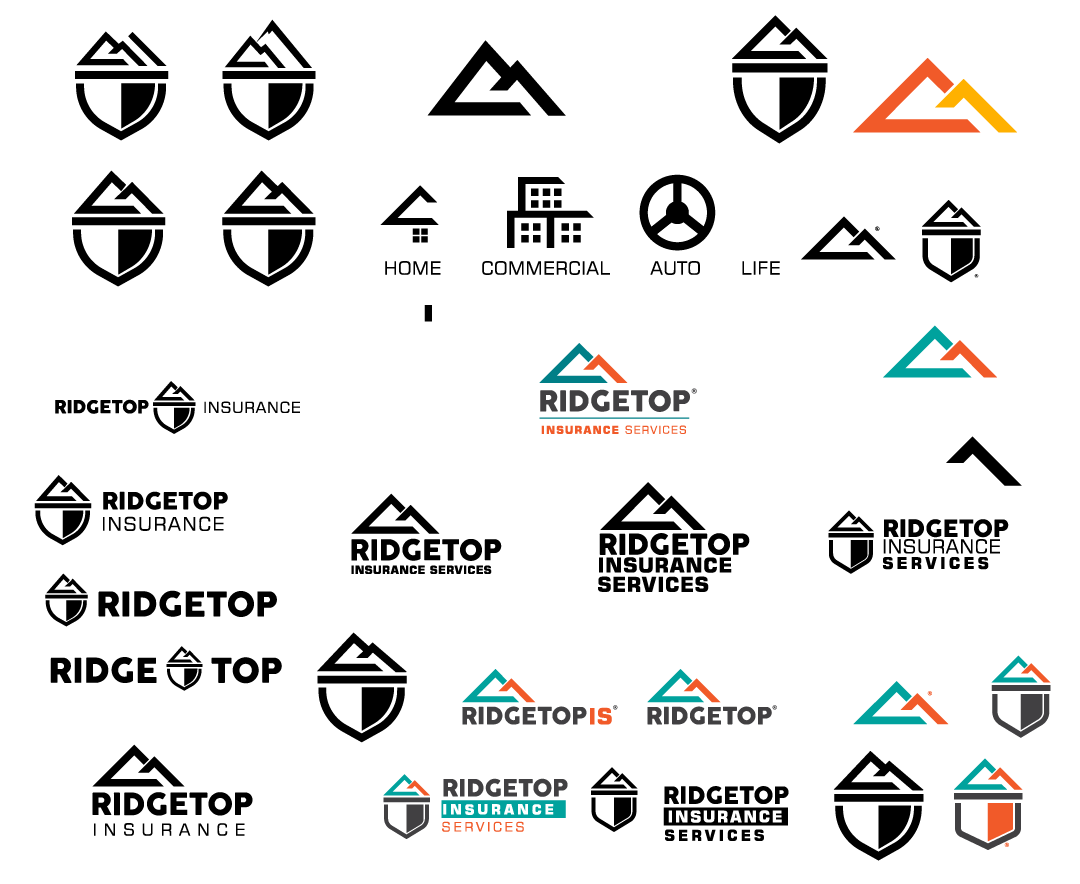
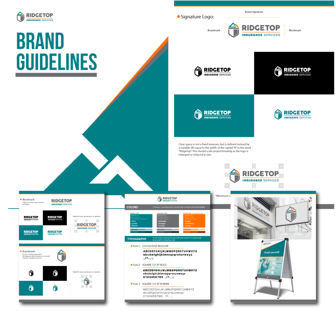

Vincent has exceeded our expectations, with his attention to details and deadlines, this is the single best investment for our business. I would highly recommend working with Meltmonkey Design Studio.
-Anita Nava, COO
Wood Floor & More offers premium wood flooring to their customers. The store was acquired by a new owner who was seeking to re-brand the company in a way that reflects the quality that they offer.
Date: Feb 2022
Client: Wood Floor & More
Role: Designer
Tags: #LogoDesign #Branding, #GraphicDesign, #IdentityDesign
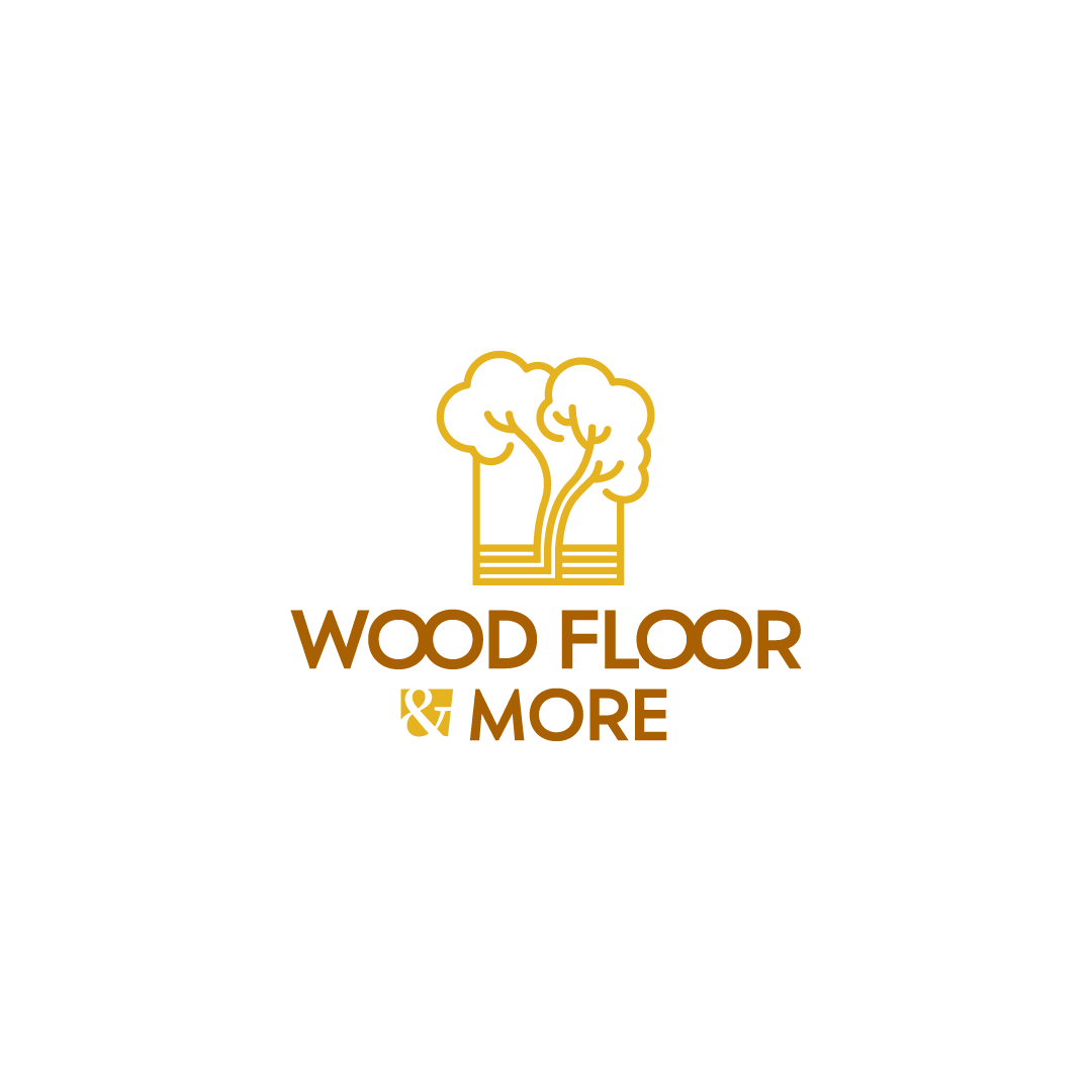
The word "elegant" is what comes to mind at first glance of this logo. Giving the feel of being a household brand and conveying a certain quality by using slim lines and open space.
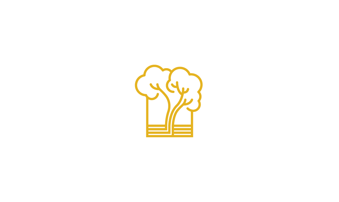
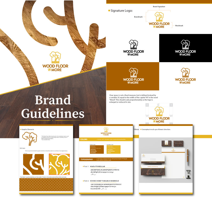
The tree icon acts as a symbol of quality. It encompasses the the process "from tree to flooring". It also has a deeper meaning with cloud like tree tops bursting outside the box, symbolizing the blossoming of a new beginning for the store and new owner.
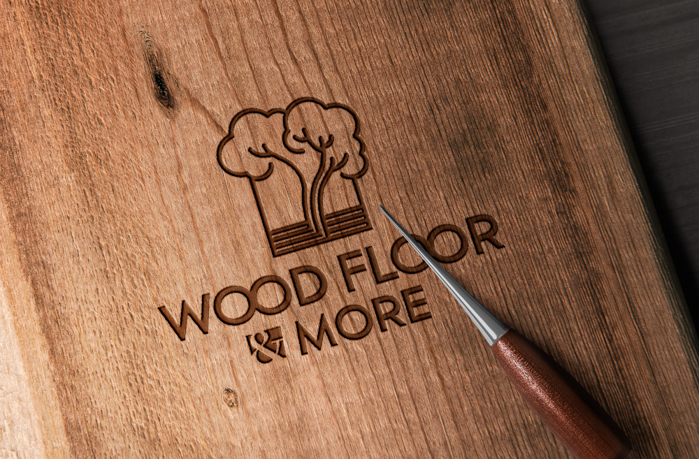
The industry of wood flooring stores is filled with brands that boast an industrial, bold kind of feel. With Wood Floor & More the correct move was to go the complete opposite way.
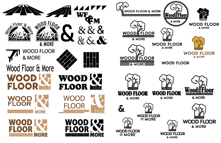
Sketching out ideas is my way to get a better understanding of where to go, and where not to go.
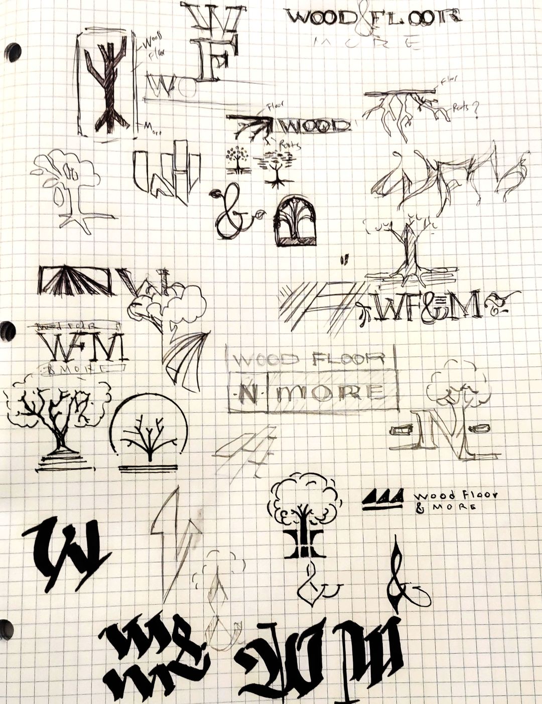
When vectorizing ideas, I created versions of the logo in the manner of the "industry standard" with bold lettering. This process was simply to confirm why I did not want to go that way.
The final stage of the desired concept was a modern elegant mark that expresses quality. The tree icon was the perfect element to be used in various ways for marketing graphics.
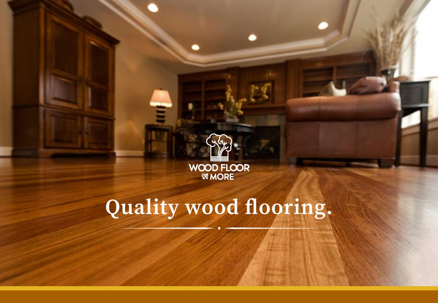
Creating a mark that went against the grain of the standard "industrial" approach was not an easy task, but after diving in and finding the perfect balance of shapes and fonts that reflect quality, the outcome was a pristine logo that represents the company and its quality of goods.
Sassy Pinup Clothing needed an online store to complement their physical location. I designed a unique website in Webflow and expertly converted it to Shopify using Udesly for e-commerce. Addressing inconsistent product photos, I organized and executed a photoshoot for top sellers, followed by editing and cropping for a clean online presentation.
Date: 2023
Client: Sassy Pinup Clothing
Role: Designer / Developer / Photographer
Tags: #WebDesign #WebDevelopment #GraphicDesign #Ecommerce #Photography #PhotoEditing
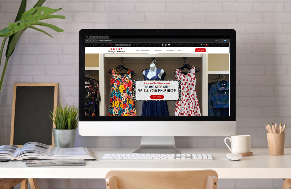
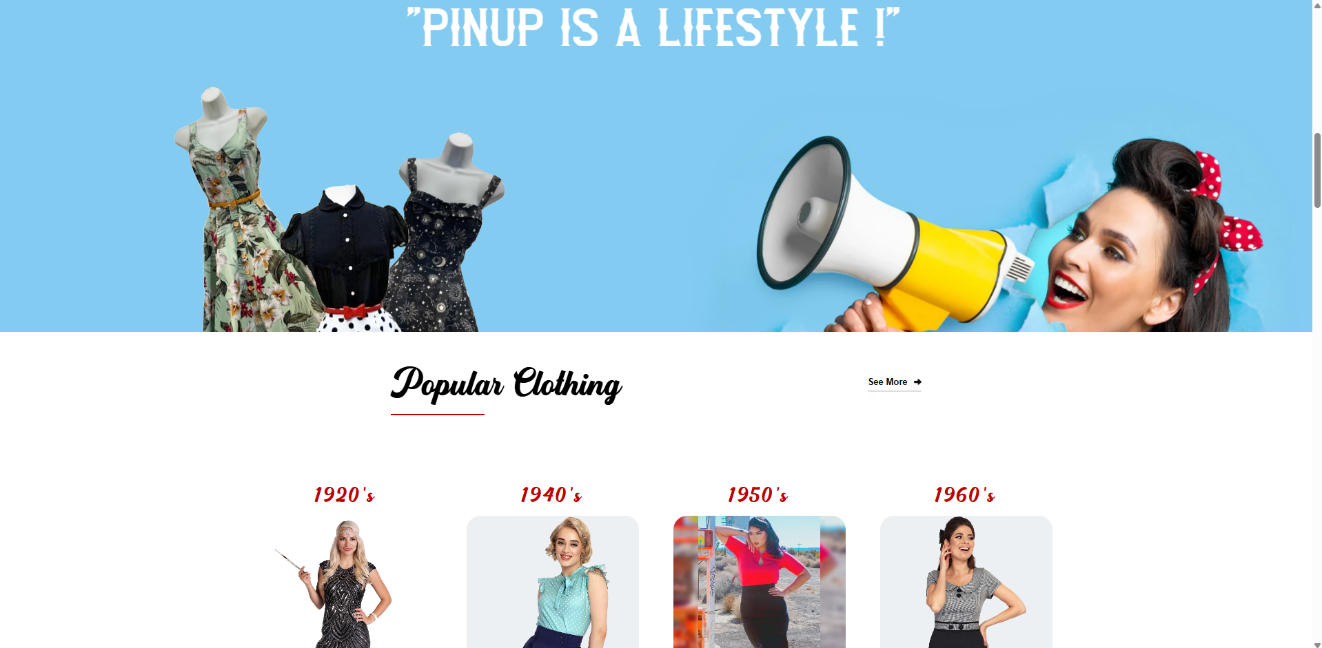
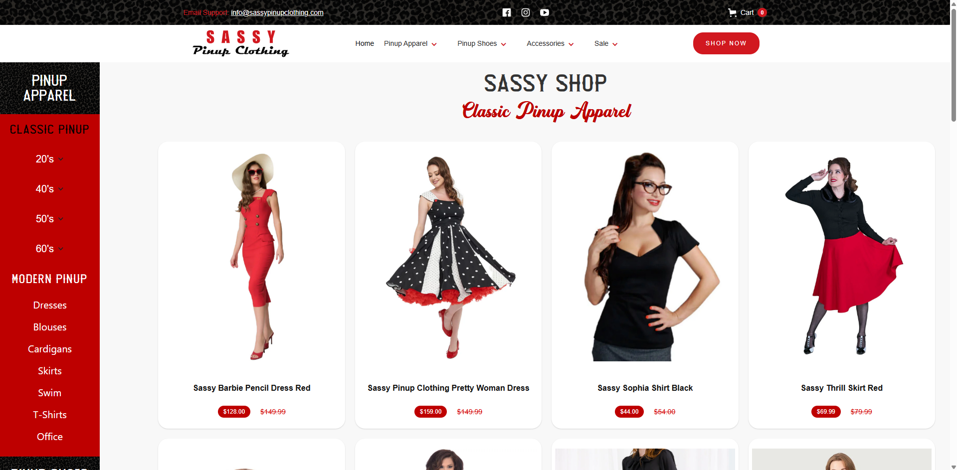

Here you can see a raw photo next to the edited image displayed on the website.
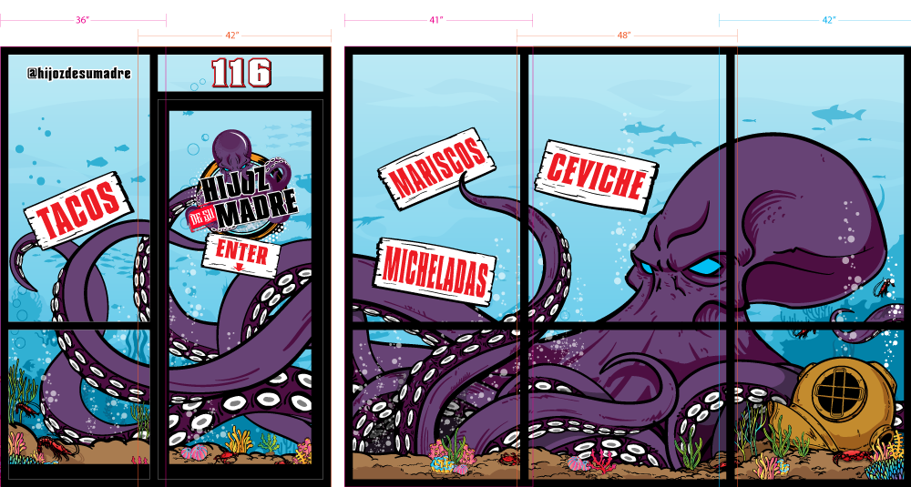
Hijoz De Su Madre, a local seafood restaurant, commissioned me to create a visually striking window wrap for their storefront. Utilizing my Wacom tablet, I developed a dynamic illustration specifically designed as a photo opportunity for restaurant goers.
Date: 2023
Client: Hijoz De SU Madre
Role: Graphic Illustrator
Tags: #Illustration #DigitalArt #WrapDesign #PromoIllustration #WallArt #Wacom

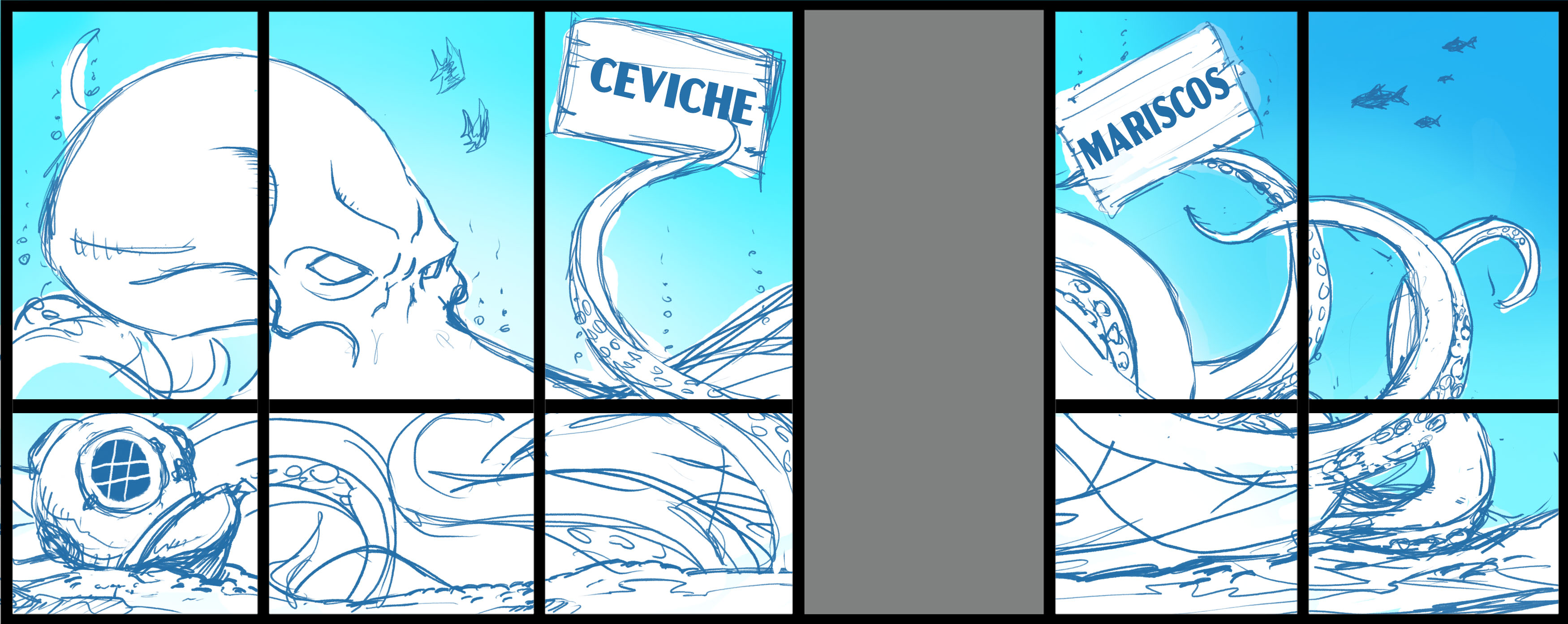
The original sketch for the window wrap.
As a new brand of beverage drinks, Tara Beverages wanted to make an impact with the launch of their 100% Coconut Water juice. The first design for this product was produced by the drink manufacturer. Tara was not satisfied with the design, and wanted something "different, hip, innovative, and stands out from the rest." So they came to me for help.
Date: 2021 - Present
Client: Tara Beverages
Role: Designer
Tags: #PackagingDesign #GraphicDesign #Illustration

To contrast and stand out, the can design had to be created in a way that was not just a graphic, but its own visual identity. We solved this by creating an actual product wordmark and icon paired with an artistic piece as the focal point.
The icon acts as an imprint symbol that can be easily identified by the brain at a glance when the eyes scan across the shelf in the market.

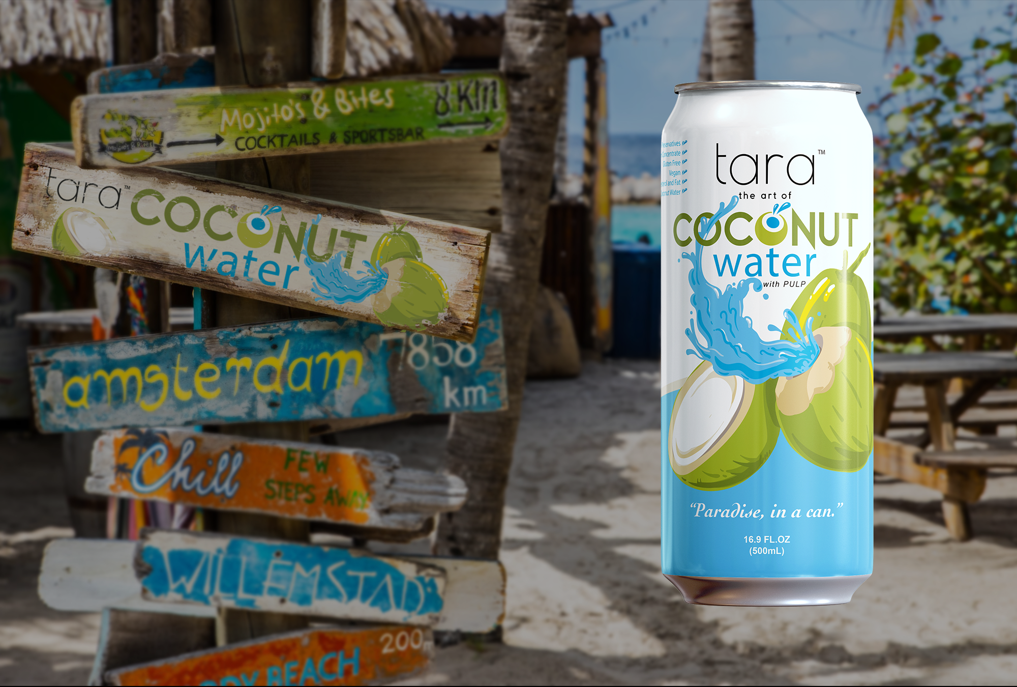
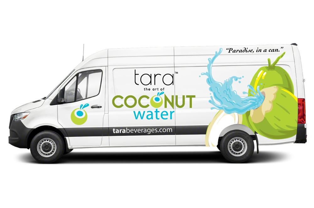
At the time, their focus was on establishing themselves as a coconut-based beverage brand. To support this, we incorporated their icon and artistic packaging graphics into various marketing assets, including a sprinter van wrap.

After a short time, they decided to expand their brand by adding more beverage varieties. They reached out to me to design new packaging because they loved the work I did for their coconut water can. Together, we developed a series of beverage collections, including fruit drinks, sparkling coconut water, and natural energy drinks. I truly enjoyed the challenge of creating eye-catching designs that stand out on the shelf—there’s nothing more rewarding than seeing a brand grow with innovative design at its core.


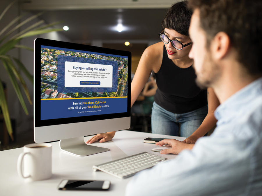
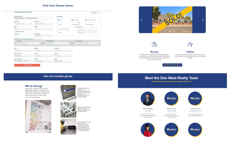
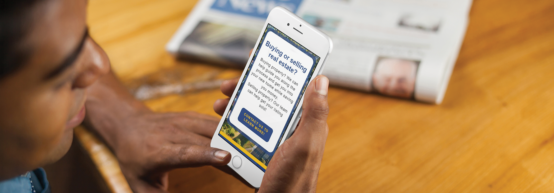
One West Realty's GoDaddy-powered website was poorly designed, with a broken layout and excessive irrelevant information. The challenge was to create a new responsive website that was simple, visually appealing and informative.
Date: 2022
Client: One West Realty
Role: Designer / Developer
Tags: #WebDesign #WebDevelopment #GraphicDesign #UIDesign #UXDesign #NoCode
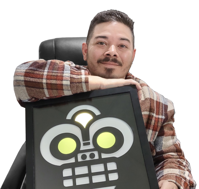
My journey into graphic design began humbly in 2002, sketching on the backs of shipping labels while working in a warehouse. By 2003, I moved into the art department as a production artist, creating vector art for screen printing and embroidery. Surrounded by talented designers and an inspiring art director, I quickly honed my skills, fueling my passion for design and boosting my efficiency.
In 2006, I became the lead designer, a role that came with its challenges—balancing production work while mentoring junior designers. Mastering keyboard shortcuts became second nature! By 2010, I stepped into the role of art director, overseeing a team of in-house and freelance designers. This position not only sharpened my leadership and delegation skills but also taught me the importance of managing budgets and meeting deadlines.
A pivotal moment came in 2015 when I started collaborating closely with the CEO on various projects. This experience exposed me to the business side of design and inspired me to study business management and marketing. It reshaped my approach, shifting my focus to logo design and brand identity. I became passionate about helping entrepreneurs bring their visions to life—strategizing the "who," "what," "where," and "why" of a business before crafting any visuals.
Today, I thrive on solving problems and creating strategic designs that empower businesses to stand out and succeed.
