
Wood Floor & More offers premium wood flooring to their customers. The store was acquired by a new owner who was seeking to re-brand the company in a way that reflects the quality that they offer.

The word "elegant" is what comes to mind at first glance of this logo. Giving the feel of being a household brand and conveying a certain quality by using slim lines and open space.
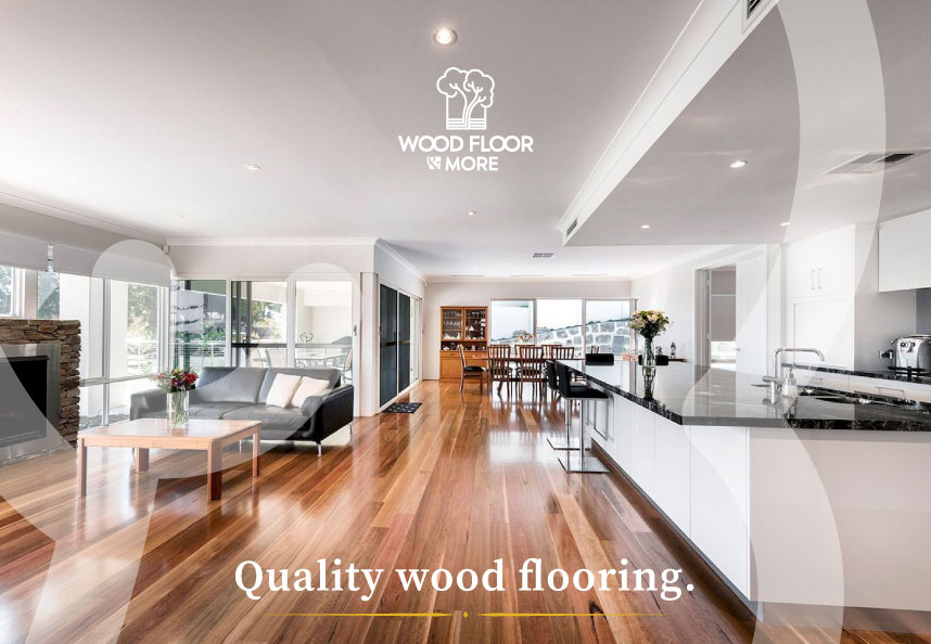
The tree icon acts as a symbol of quality. It encompasses the the process "from tree to flooring". It also has a deeper meaning with cloud like tree tops bursting outside the box, symbolizing the blossoming of a new beginning for the store and new owner.


2 Primary colors (interchangeable depending on background hue.), 1 secondary and 1 accent color comprise the brand palette.
PANTONE 139 C
Hex #a86000
R=168
G=94
B=0
C=26.84
M=65.29
Y=100
K=14.87
PANTONE 7409 C
Hex #e5b320
R=229
G=179
B=32
C=10.99
M=29
Y=100
K=0
2 Font styles comprise the logo with primarily Nyata FTR Regularto be used for marketing copy.


The industry of wood flooring stores is filled with brands that boast an industrial, bold kind of feel. With Wood Floor & More the correct move was to go the complete opposite way.
Sketching out ideas is my way to get a better understanding of where to go, and where not to go.

When vectorizing ideas, I created versions of the logo in the manner of the "industry standard" with bold lettering. This process was simply to confirm why I did not want to go that way.


The final stage of the desired concept was a modern elegant mark that expresses quality. The tree icon was the perfect element to be used in various ways for marketing graphics.


Creating a mark that went against the grain of the standard "industrial" approach was not an easy task, but after diving in and finding the perfect balance of shapes and fonts that reflect quality, the outcome was a pristine logo that represents the company and its quality of goods.


